For web development this year, as predicted, we have seen the rise of 3D, VR & AI and the is a trend that looks to be growing strong. For front-end web design several trends seem to be emerging that leading designers agree are set to grow in popularity.
In this article, learn how to identify site using using those trends, make use of them, and an inspiring world-class example to motivate your creativity.
Table of Contents
Interactive Animation And video
It is not exactly a new trend, but it is evident that animation and video are becoming more sophisticated elements of web design than ever before. Subtle details and playful interactivity that is designed to encourage the visitor to stay longer are signs of the coming of age of animation and video in web design.
How Trend-following Websites Use Animation And Video
- Custom animation unique to the message of the design
- 3D elements that move as the user interacts with the page
- Video as background
- Continued use of parallax
- 3D video effects
- Mouseover effects
Example – Canva
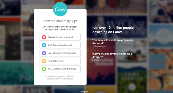
Canva is a delightful example of animated mouseover effect in action. All The fun of mouseover effect of the early days of the web circa 2002 feels like it has been reborn and modernized for the rich user expectations today. It’s a pretty nifty image editor too!
Example – The Hunt For The Cheshire Cat
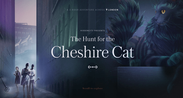
Another good example of animation is the rich experience of The Hunt for the Cheshire Cat that takes the user on an imaginative journey where getting lost in the website is actually encouraged and an intentional part of the experience.
Clean Decorative Details
I am really happy to see a revival of detail in web design. It feels like the soul has been put back into the craft. I think the rush to be mobile friendly and flat really helped push the mobile platform to a place where it could make the web accessible on a much larger scale. Now is the time to get creative.
How Trend-following Websites Use Decorative Details
- Embellishments of geometric shapes and icons.
- Details that bring focus to one part of a design for user experience purposes
- Less distracting details in the used for decorative purposes
- I think The State of European Tech is a fine example of decorative an clean details
Example – The State of European Tech 2017
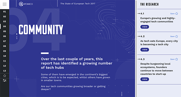
The State of European Tech showcases a design with decorative embellishments. the background details either serve to add to the users understanding of a challenging navigation system or add to the theme of the design.
Breaking Out Of The Grid
This is one trend that should be used with caution. It is fun to experiment but easy to go too far. However, if the target market of your website is open to it, you could try to be like some of the trendiest websites around by breaking out of the grid and adding original unexpected layouts and details to your website that really makes it different from your competitors.
How will trend following websites break away from the grid
- Asymmetrical layouts
- Unexpected details
- Page layouts that break the mold, creative hamburger menus and floating social bars are good examples
- Media of various kinds occupying the same area
- unusual, but still usable, page layouts and arrangements
Example – Gourmet House
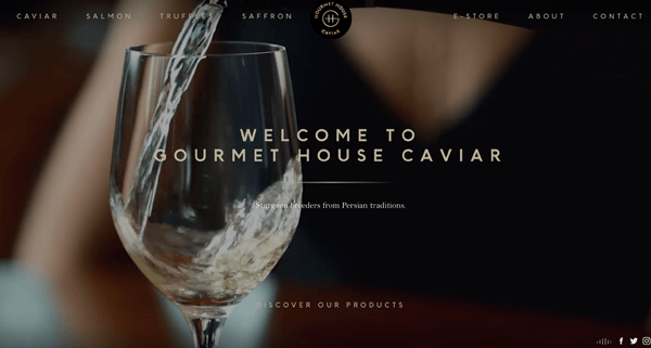
A brochure site with a simple amount of content and plenty of strong images like gourmethouse.com can work really well by breaking out of the grid. Gourmet House provides a rich experience with a luxurious feel where the user never quite knows what to find next but can still easily find their way around the simple navigation system. Still, when the user likes to feel more secure, like when buying online, the experience of the brochure section of the website is used more moderately and becomes more grid-like.
Typography
The rules of Typography are changing: designers are no longer content to play it safe when so many are opting to stand out from the crowd with bold typography.
How will trend following websites use typography
- Rule breaking, experimenting with spacing, sizing, and weight.
- Mixing it up with Serif and Sans-serif font families
Example – 10×17
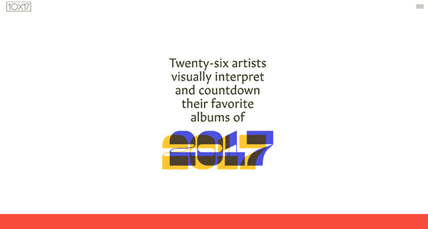
Still paying attention to legibility where it matters, Readability of content matters so leave the experimentation to adding details to smaller sections of text like headings.
The website I have chosen with admirable typography is 10×17 where Twenty-six artists visually interpret and countdown their favourite albums of 2017. I really like the bold and unexpected font choices and how typography is incorporated is incorporated into the theme of the design.

